knack's new look...
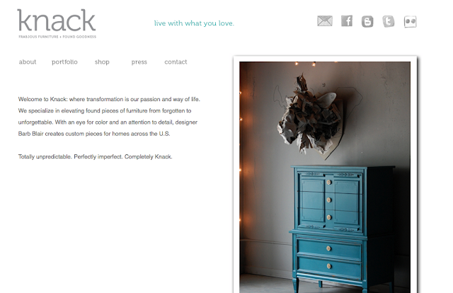
Well friends, the hubs and I have been working on this for months, and the day is finally here! I want to introduce you all to our new look! Knack received a little before and after of it's own!
 |
| business cards |
 |
| new website |
 |
| business cards and price tags |
I was feeling the need for a cleaner, more timeless look for Knack and so I teamed up with the best , most talented graphics guy that I know... Jon Blair with Ignite Design (who you all may also know as my handsome guy, but that little detail is beside the point!) and he knocked it out of the park! There were a few things that I wanted to incorporate into my new look:
1. I wanted to incorporate the furniture into the logo
2. I love everything off centered, and tend to shoot my furniture that way, so the idea for the furniture coming off the edge of the card came out of that concept.
3. Turquoise and gray are two of my favorite colors and my most popular sellers, so it seemed natural to use those colors
4. I wanted the website to be clean, easy to navigate, and include larger photos.
I am so excited about this fresh new look for Knack, and have been dying to share it with all of you! I hope you likey like!
Happy Monday!
xo
